Have you tried doodling letters? Were you able to write letters or words with different styles, designs, and by using different strokes? When using a word processing tool such as Microsoft Word, were you able to use various fonts? Which one were your favorite? Do you have a preferred font?
Learn more about this in our lesson 'Dimensions of Media and Information - Text' where we will discuss about Typography.
Take a look first on the Content Standard, Performance Standard, Learning Outcomes and Competencies of this lesson.
Now that you have read the standards and expected outcomes. Take a moment in checking your prior knowledge about the topic by answering the pre-test here.
Typography refers to the style, arrangement, and appearance of the letters, numbers, symbols, and printed matter created by the process. As a process, it is the art or technique of arranging type to make written language, legible, readable, and appealing when displayed. The arrangement of type involves typefaces, point sizes, line lengths, line-spacing, letter-spacing, and adjusting the space between pairs of letters.
Living in the 21st century means living in a world of powerful 24/7 media. As you have been discovering in this course, a large amount of your waking hours was spent with media. In other words, you are surrounded by media products, such as television programs, films, CDs, books, newspapers and website pages. Hence, it is important in your day to day lives to be able to process the information presented in these various types of media.
Take a look on what you will learn in this lesson and the expected competencies or skills you will be able to do when you finish the lesson.
In this lesson, you will learn the dimension of text media and information. Particularly, you are expected to:
- Identify the basic elements in creating a text-based presentation;
- Evaluate the text-based presentation through the design principles and elements; and
- Create a text-based presentation (campaign poster) by using design principles and elements.
Recall that every media product conveys messages both implicitly and explicitly. Let's find out how much you can communicate with these media products.
Magazine Talk
Study these magazine covers. Below are questions that will help you understand how magazine covers convey messages.
 |
| Source: https://preview.tinyurl.com/y6fxhldw |
Submit your answers in this form: SUBMIT
Very good! You were able to draw out the message. Truly, you are now becoming a media literate individual.
In studying the dimensions of media and information, you need to remember the following:
- All media messages are 'constructed.'
- Media messages are constructed using a creative language called codes and conventions with its own rules.
- Different people experience the same media message differently.
- Media have embedded values and points of view.
Pass the COVID-19 Message
Walking around in the streets of Cebu City, you can see and read many posters about COVID-19. Study one of the posters below and find out how the message is conveyed.
 |
| Source: https://preview.tinyurl.com/y6td8r2j |
Submit your answer here: SUBMIT
Certainly! Having this kind of poster immediately gives the audience its desired messages. This is called TEXT - based media presentation. So, what does it mean?
Generally, a text is defined as a unit of meaning for interpretation and understanding. Yet, in the context of media and information, it is any simple and flexible format of presenting information or conveying ideas whether handwritten, printed or displayed on screen.
In the absence of images or drawings, text is the easiest way of communicating to your audience. Take note, text-based media presentation is a very powerful tool in disseminating information, providing direction and giving suggestions. It can be done formally or informally.
Formal text-based media like news articles, published books, newspapers, magazines, advertisements, research works are created and distributed by established institutions such as publishing companies or news agencies and go through a rigorous process of editing or evaluation and are usually governed by censorship of the government.
On the other hand, your SMS or text messages, online messages on social media platforms are examples of informal text-based materials. They come from personal opinions or views on different issues, processes and distributions.
No matter how brief or lengthy a text-based media is, it is always carefully written with the intent of sending a very specific message to a target audience.
Studying how to make a text-based media presentation lead one to study typography.
Typography is a major function to design. Typography is the art or process of setting and arranging typefaces to stylize the appearance. A font or font type is another word for typeface. The use of various font types can express different emotions or meaning. Study them below.
Serif
Serif typefaces are very legible. It can be used for any purpose. It instantly evokes a sense of establishment and tradition, an association that is carried through into the branding of many banks, law firms and newspapers. It's a favorite font style in publishing, with most books still set in serif type, helping to communicate a mood of intellect and authority to readers. Serif fonts are perceived as trustworthy and dependable.
Slab Serif
Slab serif fonts are chunkier, bolder interpretations of the serif type style. Usually thicker along both the stem and serifs of letterforms, they inherit some of the traits of serif fonts, such as stability and tradition, but are also bolder and more distinctive.
Slab serif has strong, capable and enduring perception. It gives the impression of assertiveness and power.
Sans Serif
Referring to a wide group of fonts which lack serifs (the small strokes attached to the ends of letterforms on serif fonts), sans serif typefaces were formally invented in the early 19th century but only became popular much later, during the 20th century, when the modernist movement championed a break away from traditional design forms, including serif type styles.
Sans serif fonts are progressive and emotional fonts, historically popular as advertising fonts and cool fonts for posters. Sans serifs culturally represent a break with tradition, giving these emotional fonts a progressive personality.
Scripts
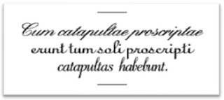
Script and handwritten fonts can lean towards formality or naivety, depending on the style and context. Many contemporary script fonts are more informal and eclectic, mimicking the diversity of modern handwriting styles.
These eclectic and different fonts are evocative of handwriting and doodling, connecting them with creativity and eccentricity. Given their unique and quirky form, these emotional fonts are rarely somber. Script fonts also remind the viewer of youth and first romances, making them a popular choice for Valentine's cards and wedding invitations.
Decorative and Display
Sometimes referred to as Novelty or Occasional, includes typefaces of unusual and unique design that do not fit into the other classification. Some of these types of powerful fonts create a sort of pictographic representation, blending a graphic image, while others are simply heavily stylized.
Display fonts are largely meant for that purpose alone, meaning they can work wonderfully as part of headlines or logo designs. In the psychology of font, they are often called the independent fonts. Designers and brands usually opt for a display font to give an impression of individuality and difference, which help foster a sense of uniqueness and inspire fierce loyalty.
Typography can do everything from adding meaning to drawing attention to readers. Functional properties type require that the reader identifies words and knows their meaning. The specific shape of a typeface may elicit an emotional or cognitive reaction in the reader; a sense of mood, personality or beauty. In this way, type can provide more meaning than that which the designer has control over in his choice of words.
Design principles
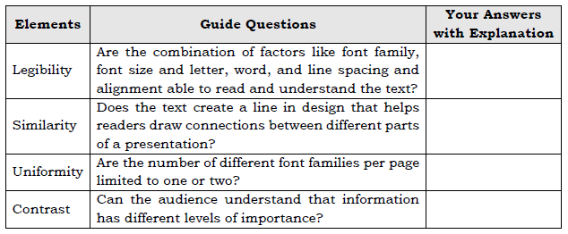
- Legibility: Making sure the audience can read and understand your text.
- Legibility is a combination of factors: font family, font size and letter, word, and line spacing and alignment
- Legibility of body text varies for different audiences:
- Younger audiences may be able to read fonts sized at 8 or 9 points.
- Older audiences may be able to read font sizes around 10 points or above.
- Font sizes above 14 points break down the continuity of the text, making text appear too gray.
- If letters, words, or lines are too close together, readers have a hard time because text blocks tend to look too dark.
- If letters, words, or lines are too far apart, readers have a hard time because blocks of text tend to look too light, causing readers to lose a sense of continuity.
- Spacing between words needs to be consistent to promote legibility; too much variation leads to eyestrain.
- Similarity, alignment: Using typography to create relationships between similar kinds of information.
- Uniformity or consistency: Repeating familiar elements to focus your audience's attention.
- To maintain overall uniformity, limit the number of different font families per page to one or two.
- Use the same font for headings and body text to produce a uniform look; this is known as concordance.
- Contrast: Creating interest and distinguishing different types of information with different typefaces. One element of contrast is hierarchy - making sure the audience understands that information has different level of importance.
- To create contrast, you could use two font families, one serif and one sans serif.
- To avoid conflict, avoid using two font families of the same variety, such as two serif fonts.
- Tracking refers to the space between all of the letters in a line.
- Font families have built-in tracking that works well for body text.
- For headings, you can change tracking to create contrast.
- Hierarchy helps your audience distinguish between levels of information, such as headings versus body text.
- Many documents are divided into hierarchical section.
You are done with the discussion. Now, practice your skills with the following activities.
Activity 1: Know Your Typeface!
Very good! Remember that knowing the characteristic of typeface or font style is the first step in making a good typography.
Activity 2: Rule to Design
Wow! You surely remember the principles of designing typography.
Activity 3: My Best Element
Very well done! You have now the touch of an artist.
Let us now review and summarized the lessons you have learned.
Do not forget that...
- Typography can play a key role in design.
- Good typography starts with font family; choose these to meet your design goals, but keep them limited.
- Use text alignment to create relationships between different kinds of information
- Create contrast by using a serif font for headings and a sans serif font for body text (or vice versa). You can also use italics, bold, tracking, or color to create contrast.
- Use contrast to indicate hierarchy.
Make a Typography Poster
At this point, share with us what you can do by making a typography poster.
Situation: The Pandemic has caused unimaginable changes in our lives especially the way classes are held. In this "new normal" system of education, many students find it difficult to adjust. Some have gone to social media to complain about their situation.
Task: Design a typography poster that promotes positive behavior in this new normal system of education. Use the Test-based Media Design Element Framework and rubrics below as your guide.
Text-based Media Design Element Framework
Rubrics:
Submit your output here: SUBMIT
I am sure you have a wonderful and interesting poster. You are doing an amazing job! You are almost done.
Review the lesson above and take the post-test when you are ready.
Click here to start answering the post-test.
Well done! You have completed this lesson successfully. Congratulations!


0 Comments